Top Kitchen Colour Schemes in Australia (2026 Guide)
Here in our paint factory, we see a lot of kitchens come through, every shade, every tone and every “it looked different in the showroom” moment. We see it all!
One thing we’ve learnt? Painted kitchen cabinets never look the same in every space.
That’s why we always encourage clients to take samples home. Seeing a colour on cabinetry, under your own lighting, morning sun, afternoon shadows, night-time downlights, makes all the difference when it comes to choosing the right kitchen colour scheme with confidence.
Because sometimes… we get an order for painting kitchen cabinets and think, “yep, that’s different.” And not always in a good way. This is where things get tricky, because once your order is placed, you don’t actually see it finished again until it arrives on site, ready for installation.
That’s why it’s important to take advantage of any review opportunities along the way. We arrange for colour sample approval before the final painting begins, which means you’ll have a chance to see and confirm your chosen colour under your own lighting before we proceed. If you’re at all unsure, this is the stage to make changes.
Because, unlike painting a wall, where you can quickly repaint if it’s not quite right, your kitchen cabinets are a much bigger commitment. Once they’re painted, they’re there to stay.
That’s why choosing the right kitchen colour scheme isn’t just about “I think this looks good”. It needs to be something you’ll still love long after the install is done.

How to Choose the Right Kitchen Cabinet Colours (Without Regret)
We get it: the options are endless, every sample looks good in isolation, Pinterest is full of inspiration, and suddenly what should be exciting starts to feel like a big decision you really don’t want to get wrong.
And honestly… that’s fair. Cabinets aren’t like cushions you can swap out when you get bored; they’re a long-term commitment.
Here’s what we always guide our clients through before they commit.
Consider the Size of Your Kitchen
Space changes everything.
In smaller kitchens, lighter colours work best. Think soft whites, warm neutrals, gentle greys. These colours help open the space up and make it feel bigger than it is. They reflect light, keep things feeling airy, and are a safe base to build from.
If you’ve got a larger kitchen, that’s where you can lean into deeper tones. Navy, charcoal, and even darker earthy shades can bring warmth and a more grounded, intimate feel without closing the space in.
A lot of the time, we’ll suggest starting light and layering from there, especially if you’re unsure. You can always introduce contrast through your island, benchtop, or splashback without committing your entire kitchen to a bold colour.
Think About Your Lighting (This One Catches People Out)
Lighting is probably the biggest reason colours go wrong.
A colour that looks perfect in a showroom (or even in our factory) can feel completely different once it’s in your home. Natural light, shadows, and even the direction your windows face will all change how that colour reads.
Lots of natural light? You’ve got more flexibility to go darker.
Low light or enclosed space? Lighter tones will help lift everything.
Then there’s artificial lighting:
Warm lighting softens and enhances earthy tones and timbers.
Cooler lighting works better with crisp whites and greys.
This is exactly why we push samples so much. You need to see it in your space, not ours.
Match the Colour to Your Home (Not Just the Trend)
Trends come and go, but your home’s style stays.
If your space leans modern and minimal, cleaner palettes like whites, soft greys, or darker contrasts tend to work well. If your home has more warmth or character, those softer tones, creams, sage greens, taupes usually sit more naturally.
We always say: your kitchen doesn’t have to be neutral to be timeless.
It just has to feel like it belongs in your home.
Don’t Be Afraid… But Be Smart About It
Some of the best kitchens we’ve seen are the ones where clients took a bit of a risk. For example, in a recent project, one client chose a light blue for their island cabinetry while keeping the surrounding cabinets neutral, resulting in a striking focal point that enhanced the overall aesthetic of their kitchen.
A deeper island colour. Darker lower cabinets. Something a little different.
But there’s a difference between intentional and impulsive.
If you’re unsure, don’t go all-in straight away. Use colour in areas that can stand alone, like an island or feature cabinetry, while keeping the rest more neutral. It gives you personality without the risk of overwhelming the space.
Use a Simple Rule to Keep It Balanced
When everything starts to feel like too many choices, we bring it back to something simple:
- 60% main colour (usually your cabinetry)
- 30% secondary (benchtops, splashbacks)
- 10% accents (handles, tapware, stools, lighting)
It’s not a strict rule, but it helps stop things from feeling either too flat or too chaotic.
Don’t Overlook the Finish (It Changes More Than You Think)
One thing that often gets missed when choosing a kitchen colour scheme is the finish, or more specifically, the sheen level.
The same colour can look completely different depending on whether it’s matte, satin, or gloss. It can appear softer, deeper, lighter, or even slightly different in tone depending on how it reflects light throughout the day.
We see this all the time in the factory: clients choose a colour they love, but once the finish is applied, it takes on a whole new look.
To learn more about Paint Sheen selections, explore our blog Paint Sheen Levels for kitchen cabinets.


Our top 5 Kitchen Colour Schemes
Here are the top 5 kitchen colour schemes dominating Australian homes right now, inspired by real projects we’ve helped paint.
1. Soft Warm Whites & Light Neutrals (Timeless with a Twist)

Soft whites are still a favourite! But not the harsh, clinical whites of the past. Today’s kitchens lean into warmer whites, greiges, and subtle neutral tones that feel inviting and lived-in.
Why it works:
- Makes spaces feel larger and brighter
- Pairs beautifully with timber accents and stone
- Works in both modern and classic homes
Best paired with:
- Oak or walnut accents
- Brushed brass or soft gold handles
- Matte or satin polyurethane finishes
Is this hand-painted? Yes, and this is where a hand-painted finish really shines, giving subtle brush texture and depth you simply can’t achieve with flat factory finishes. Explore our service hand-painted finishes.
2. Deep Navy & Dark Statement Kitchens (Luxury Meets Function)

Dark kitchens are making a serious comeback, especially navy, charcoal, and near-black tones. These colours create a bold, high-end feel while still being practical.
Why it works:
- Adds depth and contrast in open-plan homes
- Hides wear and tear better than lighter colours
- Creates a designer, architectural look
Best paired with:
- Timber benchtops or feature islands
- Brass or gold hardware
- Under-cabinet lighting for contrast
Dark tones like navy are now considered timeless rather than trendy, especially when layered with texture.
A polyurethane finish is key here; it delivers durability, smoothness, and that refined, luxe finish darker colours demand. Explore our service Polyurthane finishes.
3. Muted Greens (The New Australian Favourite)

Green has quickly become one of the most popular kitchen colours across Australia, especially sage, olive, and eucalyptus tones.
Why it works:
- Feels calm, natural, and connected to the outdoors
- Complements timber, stone, and earthy textures
- Adds colour without overwhelming the space
Best paired with:
- Stone benchtops with soft veining
- Natural timber shelving
- Aged brass or bronze tapware
Muted greens are part of the broader move toward earthy, grounding palettes in modern kitchens.
4. Two-Tone Kitchens (Balance & Contrast)

Two-tone kitchens are everywhere and for good reason. Combining colours (like white uppers with darker lowers or a feature island) creates visual interest without overpowering the space.
Popular combinations:
- White + timber
- Navy + white
- Green + warm neutral
- Cream + natural oak
Why it works:
- Breaks up large cabinetry runs
- Highlights key features like islands
- Adds a custom, designer feel
Mixing colours and materials is a major shift away from “match everything” kitchens. This is where a skilled joinery painter is essential, ensuring colour consistency and a flawless finish across multiple tones.
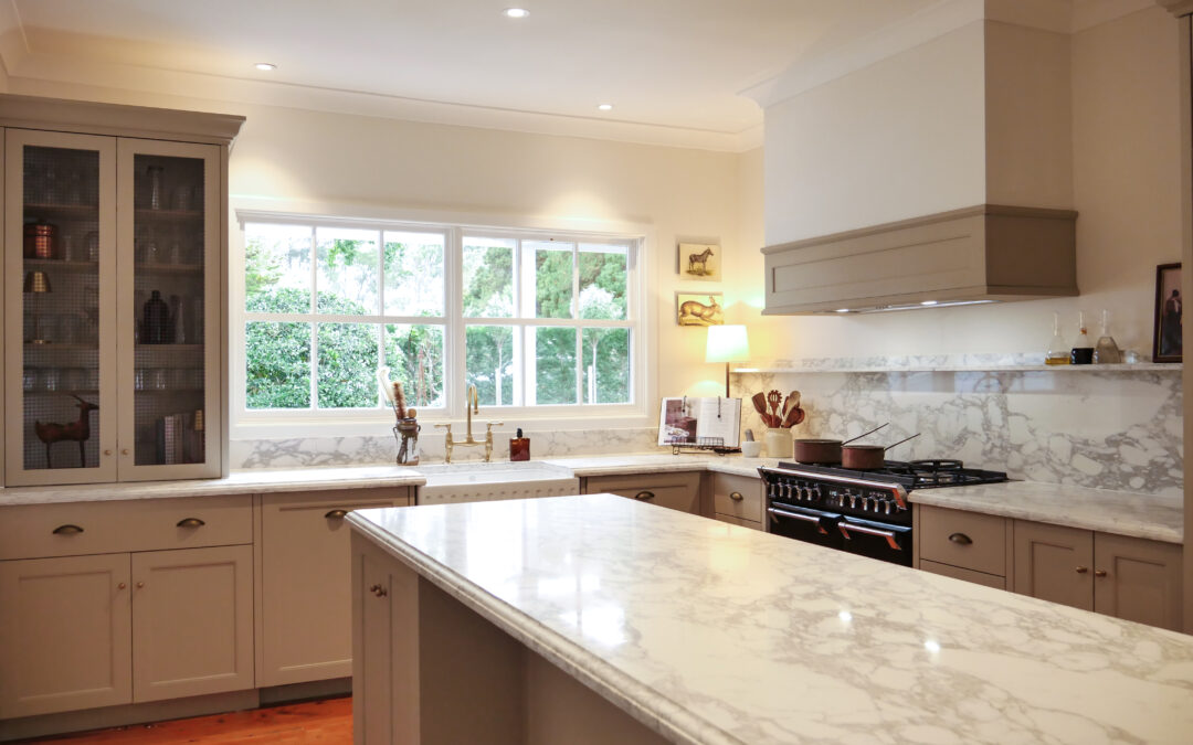
5. Earthy Browns, Taupes & Clay Tones (The Rise of Warm Minimalism)

Earth-inspired tones like taupe, mushroom, terracotta, and soft browns are redefining modern kitchens.
Why it works:
- Warms up minimalist designs
- Feels natural and calming
- Ages beautifully over time
Best paired with:
- Textured stone or porcelain benchtops
- Timber flooring
- Soft matte finishes
These tones reflect a broader trend toward warm, inviting kitchens over cold, showroom-style spaces.
In a hand-painted kitchen like this one, the colours gain depth and variation, creating a truly bespoke finish.
The Bottom Line: Kitchen Colour Scheme
At the end of the day, the best kitchen colour scheme isn’t the trendiest one. It’s the one you still love in five, ten, fifteen years.
Take your time. Look at samples in your own space. Trust how it feels, not just how it looks online.
Because once it’s painted… It’s staying.
Final Thoughts: Selecting the right Cabinet Painter
We work closely with kitchen manufacturers, builders, and designers across a wide range of projects, so we understand how many moving parts go into getting it right. Our goal is to support that process, helping guide colour decisions and ensuring you feel confident in your paint selection before it ever reaches production.
Because once it does, it’s all about execution.
Whether it’s a durable polyurethane finish or a custom hand-painted kitchen, the finish needs to be just as considered as the colour itself. That’s where experience matters! Proper preparation, consistent application, and attention to detail to ensure there are no paint runs, no missed areas, and a result that looks as good up close as it does across the room.
The right colour will make your kitchen look good.
The right finish will make it last and feel complete.
To grab a quote, don’t hesitate to fill in the form on our contact us page, and we’ll be in touch!